how-infographics-can-enhance-the-promotion-of-your-published-material
March 04, 2016
One of the greatest things about infographics is their efficiency. Wherever there is data, an idea, or story to tell; an infographic can be used to enhance the reader’s understanding — and retention — of the information being presented. They also have a longer life-cycle than a traditional article (as long as the information is still relevant, of course).
Data visualizations and infographics are an outstanding way to convey complex information to an audience in a way that is more easily digestible. If we looked at a spreadsheet with 80,000 values, how long would it take us to get a general understanding of what we were supposed to glean from the information? No one has time for that.
This post focuses on reasons why infographics work, and how they are an excellent marketing tool for authors to use when promoting their published content.
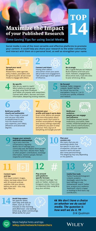
Inform, engage, persuade. Infographics have come to be used just like articles or speeches, and not just charts. When done correctly, they tell an engaging story. They share the same three objectives as public speaking. They are used to inform, engage, and persuade an audience. Therefore, by telling your story in a visual way, infographics are perfect for convincing the reader that your work is worth their attention.
Paint a picture. Studies estimate that between 50-80% of the human brain is dedicated to forms of visual processing, such as: vision, visual memory, colors, shapes, movement, patterns, spatial awareness, and image recollection. Vision is the strongest form of input that we use to perceive the world around us. Developmental molecular biologist John Medina states, "Vision is by far our most dominant sense, taking up half our brain's resources."
Our brains love to soak up visuals, and when promoting complex ideas, it is ideal for people to have something they can digest easily. An infographic that shares the highlights of a complex written text visually is a great way to attract attention and build awareness with a design that is easily shareable online.
This is an excellent example from Guy Kawasaki from when he was promoting his book Enchantment. The beautiful part of the infographic he designed was that he created simple illustrations and bullet points to highlight key elements of his book.
The key is grabbing people’s attention. You accomplish that with visuals.
√ Based on research into the Picture Superiority Effect, when we read text alone, we are likely to remember only 10 percent of the information 3 days later. If that information is presented to us as text combined with a relevant image, we are likely to remember 65 percent of the information 3 days later!
√ Combining relevant images with your text dramatically increases how much your audience remembers by 650 percent!
Your audience (humans) are visual creatures. Your published material may be mostly text, but you should use visual content as promotion. Grab your audience’s attention by giving them great visual information to comprehend, retain, and share. Infographics are much easier and faster for people to skim through and understand than press releases, book descriptions or back cover explanations.
Remember, infographics are an excellent way to communicate with your potential readers, and can be adapted to any situation wherever there is data, a concept, a process, or a story to tell.