3-ways-to-make-research-more-accessible-to-the-public
July 14, 2017
At the recent Wiley Society Executive Seminar held in Washington DC, Neda Afsarmanesh from Sense About Science USA explored how the role of uncertainty in the scientific process can impact how research is understood by people outside of the scientific community. Scientists - and others familiar with the language of research publications - are comfortable with (and expect) the use of words like “infer,” “potentially,” or “seems likely.” But when scientific language is heard by a more general audience, uncertainty is often interpreted as “we don’t know.”
How can researchers maintain the level of uncertainty required by peer reviewers and the scientific process itself without limiting the impact of their work?
Terms that have different meanings for scientists and the public. Source: Physics Today
Afsarmanesh, who currently serves as SAS USA’s Deputy Director, shared three case studies about communicating evidence more effectively to those outside of the research community who need to make decisions informed by scientific evidence.
Accuracy vs. clarity
In 2008, a controversy developed over whether or not turning on the Large Hadron Collider in Switzerland would create a black hole. Sean Carroll, a physicist who writes for the general public, wrote about the possible consequences of turning on the collider: “Stable black holes that can eat up the world, destroying all living organisms in the process, ten to the negative twenty-fifth percent chance.” A scientist might read that and think, “Turn it on. That’s fine.” But others might read “ten to the negative twenty-fifth percent chance” and think, “So, you say there’s a chance? This could happen!”
Carroll later wondered whether he and his colleagues should even have talked about the uncertainty. Should they have left it out? What was the most ethical thing to do?
When it comes to uncertainty, how precise do scientists need to be? The level of precision to report when it comes to the Large Hadron Collider may be different than the level needed for a new potential cancer drug or the effects of climate change, but no matter the context, research can be clear without sacrificing accuracy. Be sure to add context instead of just reporting the numbers. What if Carroll had written: “There’s a ten to the negative twenty-fifth percent chance that the collider could create a black hole. However, top physicists in the field have examined the data and they don’t think it’s a real possibility, or even something to be concerned about.” Maybe the public would have reacted differently.
One study vs. a compendium of studies
Many people today can’t remember a time when smoking was not understood to cause lung cancer. But before smoking was accepted as a direct cause of cancer, many studies were done to build a case for causation and not simply correlation.
As much as scientists are comfortable with uncertainty in research, once there is a body of evidence it can lead to a certain level of certainty. However, researchers and journalists don’t always do a good job of putting scientific information into context. When multiple studies are reported in the news every week identifying different substances that could “cause” cancer, this information can feel untrustworthy.
Scientists and science communicators can mitigate the spinning wheel effect of research in the news by focusing on the bigger trends, or how each individual study in a field changes our larger understanding. Don’t focus on individual reports, instead explain how each report relates to other studies.
Words and numbers vs. pictures
When words and numbers aren’t enough, making things visual is a powerful way to communicate scientific information. But pictures can also be misleading. Compare Figure 1 with Figure 2. Which one more accurately conveys information the general public needs to know about the potential impact of a hurricane, and is easiest to understand?
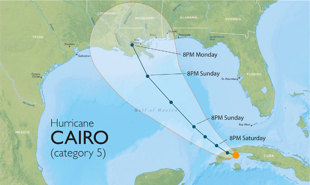
Figure 1. A traditional graphic representing a hurricane cone. There is a two-thirds probability of the hurricane being within the cone, but there is also a one-third probability of the hurricane being outside of it. Image credit: Alberto Cairo
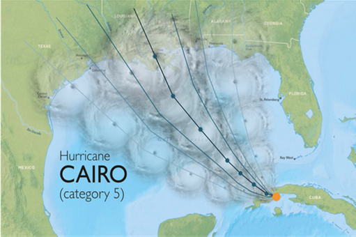
Figure 2. A modified hurricane cone, showing the wider potential path of the hurricane.
Image credit: Alberto Cairo
Looking at Figure 1, would you assume that anything outside of the cone is a “safe zone”? Alberto Cairo, Professor of Visual Journalism at the University of Florida Miami, argued that the traditional graphic is confusing, and created an alternative. Figure 2 shows a revised cone, capitalizing on the fact that most people are familiar with the idea that when something is shaded darker it is stronger or more likely, and something that is shaded lighter is less likely.
When representing data visually, scientists and science communicators can take advantage of common patterns that transcend the scientific community and make information easier to understand for everyone.
These case studies are just a few examples of how relatively small changes in how scientists and journalists communicate can result in greater understanding of the impact of scientific evidence.
Neda Afsarmanesh is Deputy Director at Sense About Science USA, based in Brooklyn, NY. Neda runs SAS USA’s Scientifically Speaking workshops, which train early career scientists on both the importance of engaging with their communities and the skills needed for successful science communication. A former scientist, Neda did her undergraduate studies at the California Institute of Technology, and her master’s degree in neuroscience at Boston University School of Medicine. Prior to joining SAS USA, Neda was senior press officer at the journal Nature.